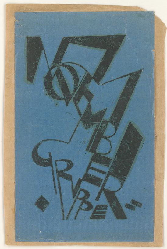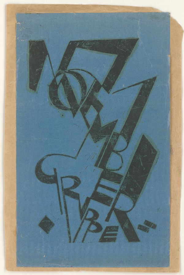
Printed in black on a blue ground is the title of the work “November Gruppe”. The word “November” stretches from top left to bottom right, and the word for “Group” is set apart underneath. The letters are composed of thin and thick lines and curves and edged in green. Some have been elongated, some are very narrow or distorted, and in some places they run into each other.
Germany, autumn 1918: The First World War had been lost. The November Revolution followed, and Kaiser Wilhelm II was forced to abdicate. But what form would the new democratic society take? Artists were as much concerned by this question as everyone else. They wanted to have a voice and to demonstrate their commitment. In Berlin painters, sculptors and architects came together to set up the Novembergruppe. They were soon joined by composers and writers, and the group evolved into one of the biggest associations of artists in the Weimar Republic. Open to any style, it was a hub for the entire avant-garde spectrum in the 1920s – from Late Expressionism and Dada to pure abstraction and New Objectivity.
Moriz Melzer (1877–1966) was a founding member, and around 1922 he designed a logo for the Novembergruppe. The letters consist of lines and curves in light and bold type. They spread dynamically across the page, demonstrating the vitality of this diverse alliance.
Novembergruppe (typographic design)
around 1922
Printing ink on blue glossy paper
35,5 x 21,5 cm
Acquired from Helga Kliemann with budgetary funding of the Berlinische Galerie, Berlin 1999
